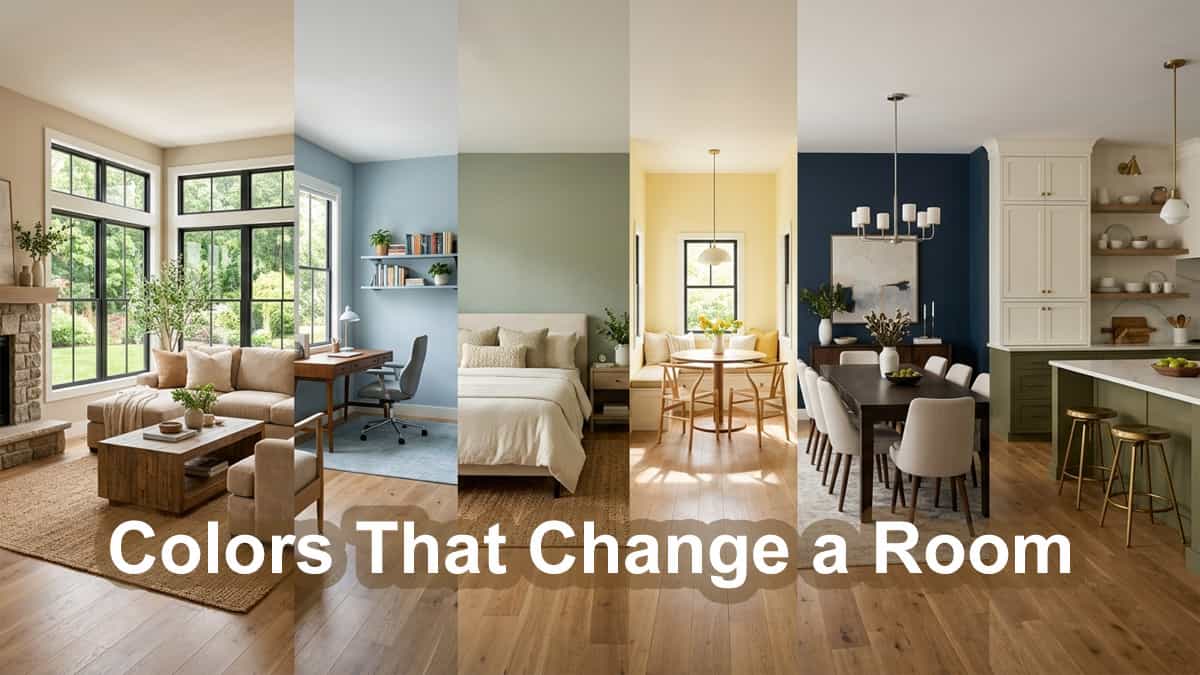
The best room colors do more than look beautiful. They shape mood, energy, comfort, and functionality throughout your home. Whether you’re exploring living room color ideas, planning a relaxing bedroom, or searching for kids room color ideas, understanding color psychology can make choosing paint colors much easier.
Room Function and Color Psychology
Living Room
Warm and Inviting
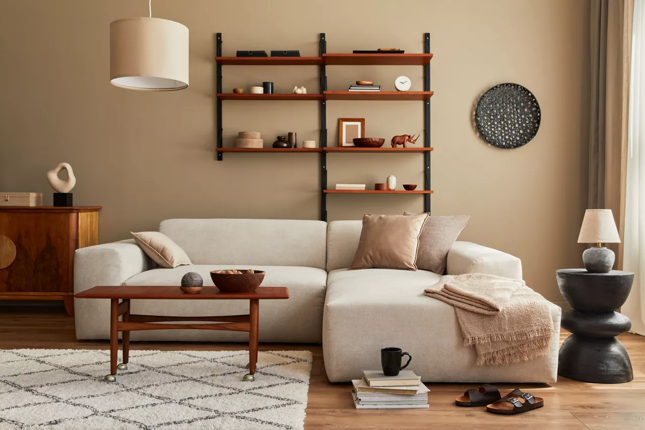
The living room is the heart of your home, a place for relaxation and socialization. Warm colors like beige, taupe, and soft browns can create a cozy atmosphere. Incorporating accent colors like rich blues or greens can add depth and interest.
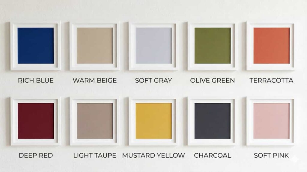
Popular Color for Living & Drawing Rooms
Compare Living Room Decor Styles
Some living room decor styles work better with warm beige, navy, or earthy color palettes. Comparing textures, modern lighting, and wall decor options first can help create a more balanced space.
- Rich Blue: Elegant and deep.
- Warm Beige: Cozy and neutral.
- Soft Gray: Versatile and modern.
- Olive Green: Earthy and inviting.
- Terracotta: Warm and vibrant.
- Deep Red: Bold and sophisticated.
- Light Taupe: Neutral and warm.
- Mustard Yellow: Cheerful and stylish.
- Charcoal: Modern and elegant.
- Soft Pink: Warm and welcoming.
Bedroom
Calm and Restful
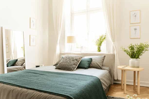
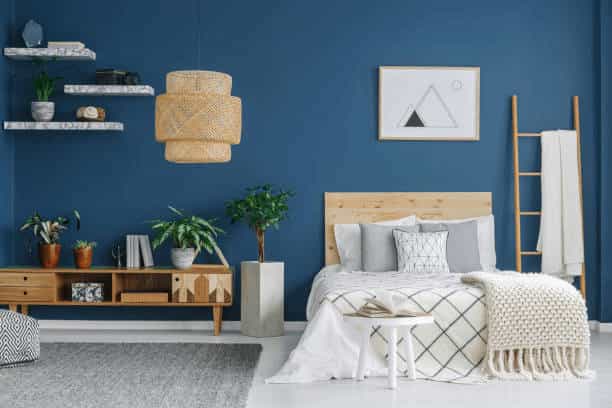
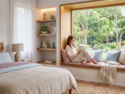
Bedrooms should be sanctuaries of peace. Cool colors such as soft blues, lavenders, and pale greens promote relaxation and restful sleep. Neutrals like gray or beige can provide a soothing backdrop, allowing for versatility with bedding and decor.
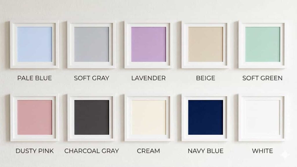
Popular Color for Bedrooms
Check Bedroom Lighting and Bedding Ideas
Soft lighting and neutral bedding often work best with calming bedroom color palettes. Comparing different materials and lighting warmth can help create a more restful atmosphere.
- Pale Blue: Promotes tranquility.
- Soft Gray: Neutral and calming.
- Lavender: Soothes and relaxes.
- Beige: Warm and versatile.
- Soft Green: Refreshes and calms.
- Dusty Pink: Warm and inviting.
- Charcoal Gray: Modern and restful.
- Cream: Light and cozy.
- Navy Blue: Deep and restful.
- White: Pure and clean.
Kids Room Color Ideas
Boys & Girls – Fun and Stimulating
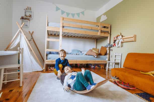
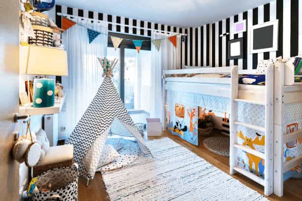
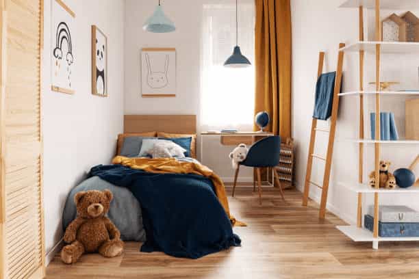
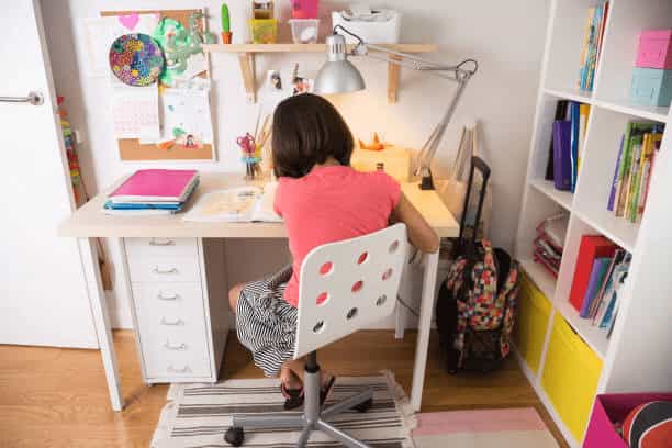
When it comes to kids’ rooms, color can be both fun and functional – especially with creative ceiling designs. Bright, vibrant colors like yellow, red, and blue can stimulate creativity and play. However, balancing these with softer shades can help in creating a space conducive to rest and relaxation.
Popular Color for Kids’ Rooms
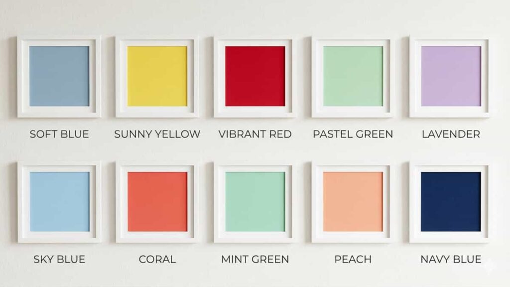
- Soft Blue: Calming and versatile.
- Sunny Yellow: Cheerful and bright.
- Vibrant Red: Stimulating and energetic.
- Pastel Green: Refreshing and soothing.
- Lavender: Gentle and peaceful.
- Sky Blue: Inspiring and calming.
- Coral: Warm and lively.
- Mint Green: Cool and calming.
- Peach: Warm and comforting.
- Navy Blue: Bold and sophisticated.
Compare Kids Room Decor and Study Accessories
Different kids room colors work better with different furniture and decor styles. Some parents prefer comparing storage, study lighting, and study-friendly accessories before designing the room.
Kitchen
Fresh and Energetic


The kitchen is a bustling hub of activity – learn how to remodel yours. Colors like white, yellow, and light greens can create a fresh and clean look. These colors reflect light well, making the space feel larger and more inviting.
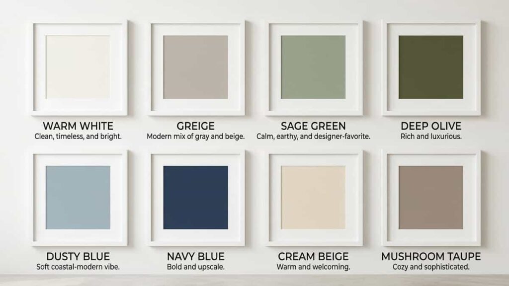
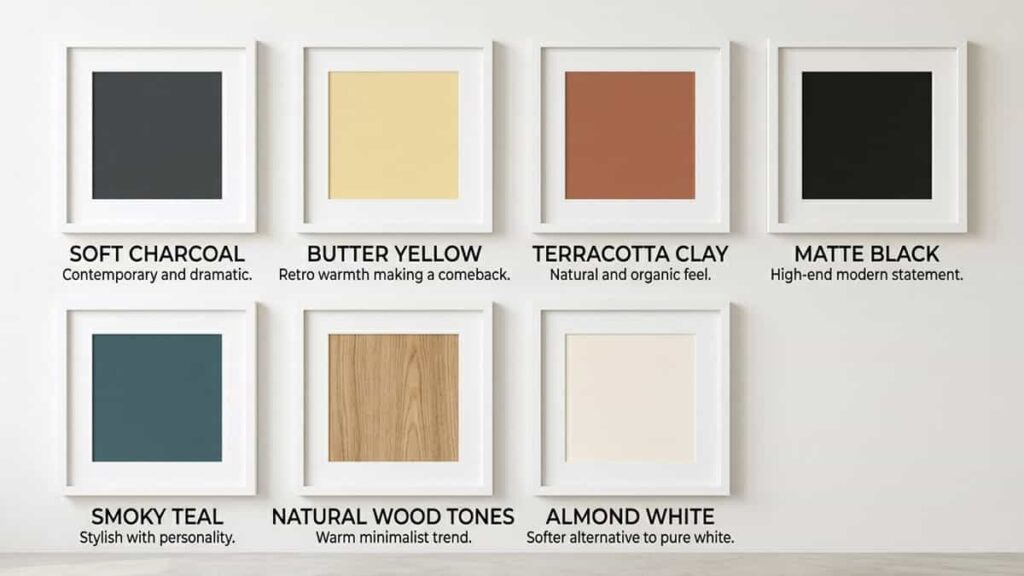
Popular Colour For Kitchen (US Trends 2026)
Check Modern Kitchen Decor Trends
Popular kitchen color trends like sage green, matte black, and warm white often pair well with modern fixtures and minimalist accessories. Comparing styles first can help maintain a consistent look.
- Warm White: Clean, timeless, and bright.
- Greige: Modern mix of gray and beige.
- Sage Green: Calm, earthy, and designer-favorite.
- Deep Olive: Rich and luxurious.
- Dusty Blue: Soft coastal-modern vibe.
- Navy Blue: Bold and upscale.
- Cream Beige: Warm and welcoming.
- Mushroom Taupe: Cozy and sophisticated.
- Soft Charcoal: Contemporary and dramatic.
- Butter Yellow: Retro warmth making a comeback.
- Terracotta Clay: Natural and organic feel.
- Matte Black: High-end modern statement.
- Smoky Teal: Stylish with personality.
- Natural Wood Tones: Warm minimalist trend.
- Almond White: Softer alternative to pure white.
Bathroom
Clean and Serene
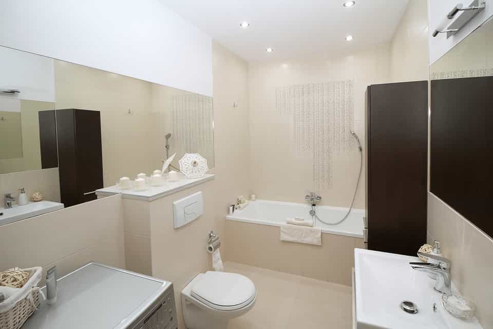
For bathrooms, colors that evoke cleanliness and serenity are ideal. Whites, soft blues, and light greens can make the space feel airy and spa-like. Adding accents in darker hues can provide a modern touch.
Top 10 Bathroom Color Trends in the US (2026)
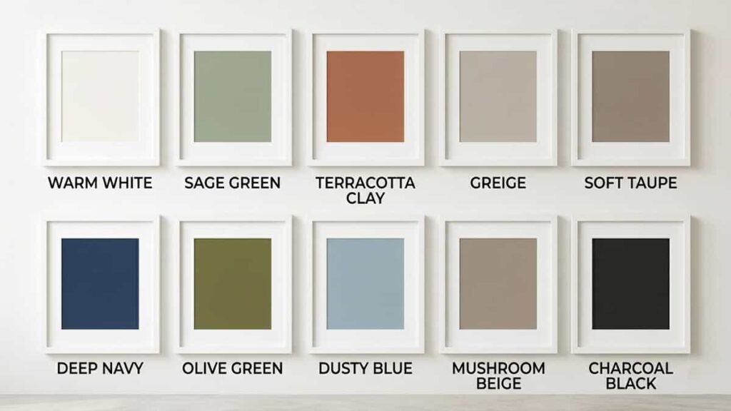
- Warm White — Softer than pure white, spa-like and timeless.
- Sage Green — Calm, earthy, and currently dominating Pinterest-style bathrooms.
- Terracotta Clay — Warm desert-inspired luxury vibe.
- Greige — Gray + beige blend replacing cold gray bathrooms.
- Soft Taupe — Cozy neutral that works with wood and stone.
- Deep Navy — Rich hotel-style sophistication.
- Olive Green — Organic and nature-connected.
- Dusty Blue — Relaxing coastal-modern aesthetic.
- Mushroom Beige — Modern organic minimalism trend.
- Charcoal Black — Bold contemporary statement for vanities or accent walls.
US bathroom trend basically shifted from:
“cold white + hospital gray” → “warm earthy spa retreat” 💀
Big designers are pushing:
- earthy tones
- natural light
- wood textures
- wellness/spa feeling
- nature-inspired palettes
Sage green, warm taupe, terracotta, and olive are showing up everywhere right now.
For quick visual grouping:
Most Popular Right Now
- Sage Green
- Warm White
- Greige
- Olive Green
Luxury Bathroom Look
- Deep Navy
- Charcoal Black
- Terracotta Clay
Calm Spa-Like Feel
- Dusty Blue
- Soft Taupe
- Mushroom Beige
And honestly… matte black fixtures + warm earthy colors = current US bathroom obsession 😭
The Role of Natural Light & Colours
North-Facing Rooms
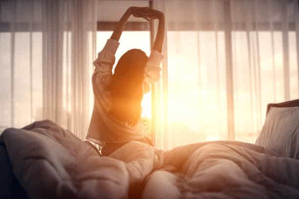
North-facing rooms receive the least amount of natural light, making them appear cooler. To counteract this, warm, light colors like creamy whites, soft yellows, or light apricots can be used to bring warmth and brightness.
South-Facing Rooms

South-facing rooms benefit from abundant natural light throughout the day. These rooms can handle cooler colors like blues and greens, which can help balance the warmth of the sunlight. Darker shades can also be used without the room feeling too enclosed.
East-Facing Rooms
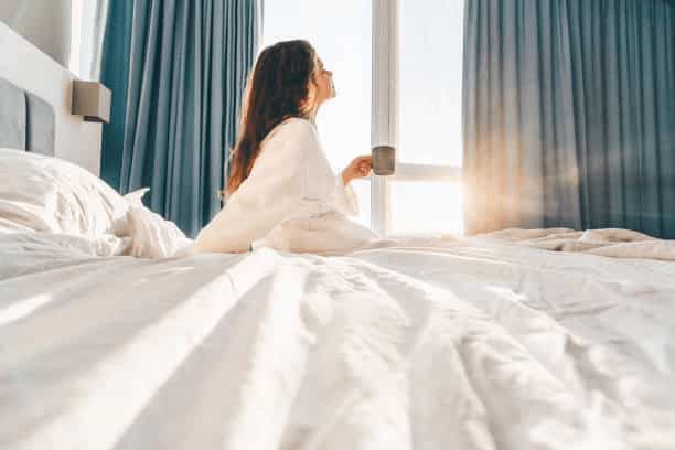
East-facing rooms get morning light, which is bright and warm, and cooler light later in the day. Soft yellows, warm neutrals, and light blues can help balance these varying light conditions.
West-Facing Rooms

West-facing rooms receive warm evening light, which can create a beautiful glow. To enhance this, warm colors such as golds, deep reds, and rich oranges work well. These colors will complement the natural light and make the room feel inviting and cozy.
By understanding the interplay of room function and natural light, you can select the perfect color schemes to enhance the beauty and functionality of your home. From the calming hues of a bedroom to the vibrant tones of a kids’ room, this guide provides the insights you need to create harmonious and stylish spaces.
Related post :
Furniture Arrangement Techniques for Different Room Shapes and Sizes